Română
Satoshi Block Dojo - Poster Design
A visual exploration designed to push the Satoshi Block Dojo brand beyond its core identity system, using poster design to test graphic expression, hierarchy, and brand flexibility.
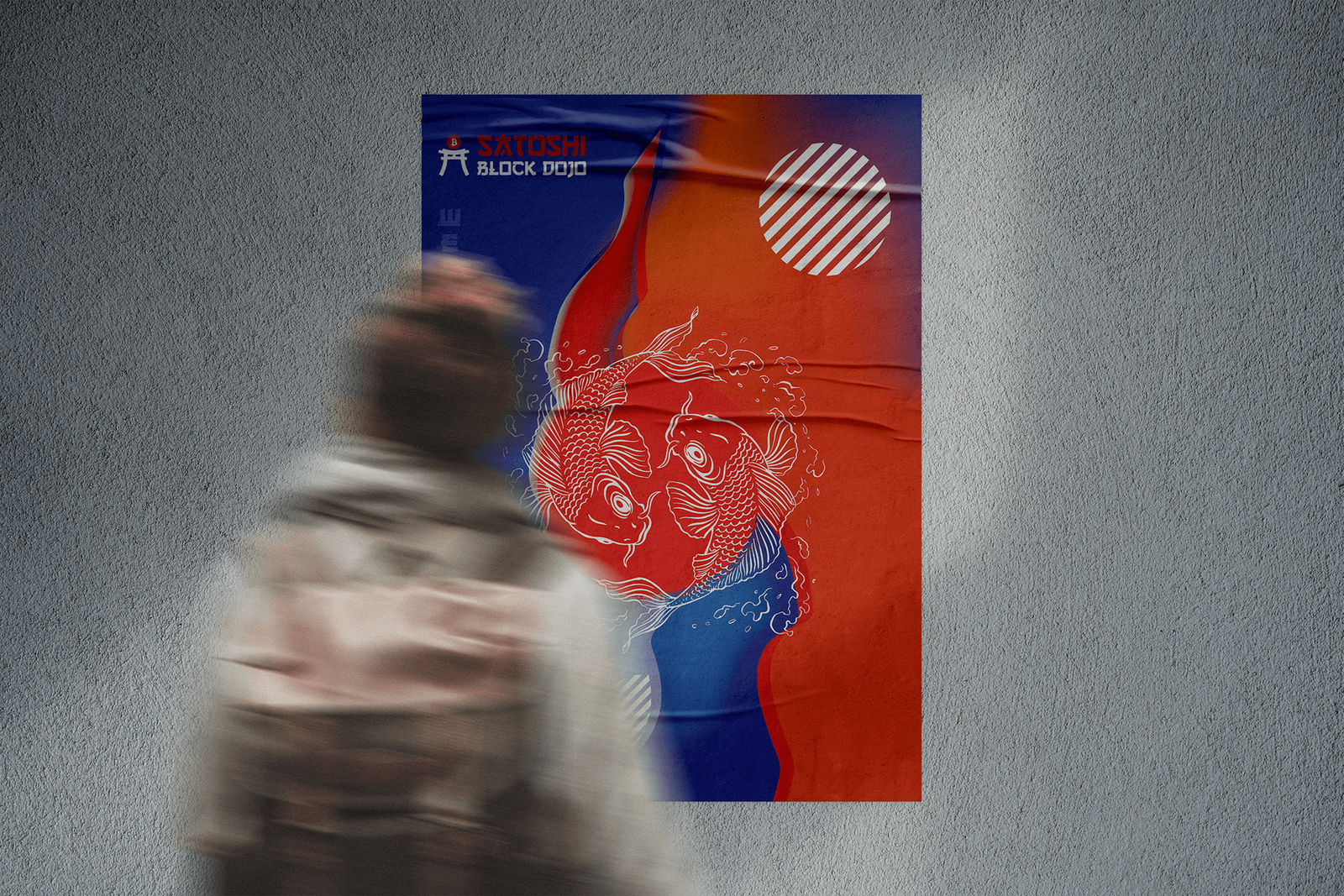
Extending the Brand Beyond the Logo
Satoshi Block Dojo needed a visual application that could move beyond the core identity and show how the brand might appear in a more expressive, public-facing format. The challenge was to keep the identity recognizable while creating a poster system with stronger energy, movement, and visual impact.
A Bold Poster System with Cultural Energy
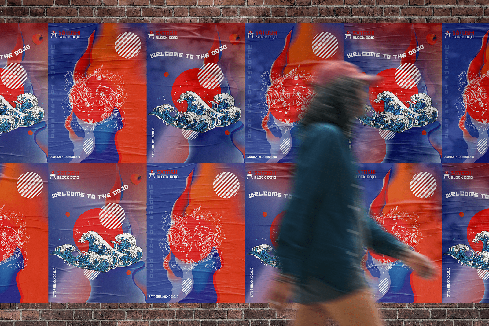
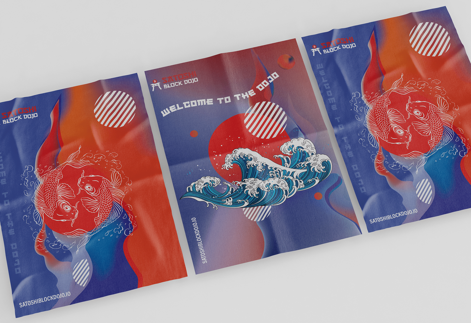
The final direction uses layered composition, intense color contrast, dynamic shapes, and Japanese-inspired visual cues to create a memorable poster series. The design gives Satoshi Block Dojo a more expressive brand presence while testing how the identity can work across promotional and environmental applications.
Research & Definition
- 01Reviewed the Satoshi Block Dojo identity and existing visual direction.
- 02Defined the goal of the poster exploration: to test brand flexibility and campaign potential.
- 03Researched Japanese poster design, dojo references, crypto culture, and bold event-style graphics.
- 04Identified key visual themes: discipline, movement, digital energy, and cultural contrast.
- 05Explored composition routes using layered shapes, oversized symbols, and strong typographic placement.
- 06Tested color combinations to create contrast, rhythm, and immediate visual impact.
- 07Applied the brand elements across multiple poster variations to evaluate consistency.
- 08Refined the final poster layouts for stronger hierarchy, balance, and recognition.
Primary Display: Chosen for its bold, angular, and futuristic character. It gives the poster a distinctive visual voice while connecting to the project's Japanese-inspired direction.
Secondary Body: Used for supporting text and layout balance. Its condensed structure keeps the composition clean, readable, and strong without competing with the main display type.
Iteration & Refinement
Composition Testing
Multiple layout variations were created to test balance, scale, contrast, and the relationship between typography, illustration, and graphic symbols.
Street Test
I checked the strongest layouts on wall mockups, where the color contrast and the oversized symbols had to hold from a distance.