Română

Independent research essay, not peer-reviewed. The proposals are my own; every source is linked so you can check it.
Every identity presentation reaches a moment where the designer explains the mark. Jung, Hume, Kant and thirty-five years of experiments on putting judgments into words suggest that moment is doing more harm than it looks. Describe the form like a recipe, show it before you justify it, and let the meaning arrive in use.
I saved two videos a few weeks apart this autumn, and only noticed later that they argue with each other. The first is an Instagram reel about Carl Jung. "Explaining a symbol can kill it," it opens. "Jung believed one of the fastest ways to kill a symbol is to explain it." The second is a TikTok from Jason Swet, an art director who now teaches art direction, the second episode of a series called "Theory of Taste." It opens: "Your taste is useless if you can't articulate it."
Put side by side, they seem to give opposite advice to anyone who makes images for a living. One says that putting meaning into words destroys it. The other says that taste you cannot put into words is worth nothing. My own work sits exactly between them. Identity work always reaches a moment where the designer has to say something about the mark, and clients expect it. Jung is also one of the writers who shaped how I think, so I wanted to know what he actually said.
I checked both videos against their sources and against the experimental research on what happens when people put judgments into words. The two claims do not collide, because they are about different kinds of words. Describing what is in front of you, in a vocabulary that matches what you can see, helps other people act on your perception. Explaining why you like something, by improvising reasons, can make the judgment itself worse. Decoding what a mark means, by translating it into a list of known ideas, is the move Jung was warning about. The logo rationale slide, the standard way identity work gets presented, usually does the second and third at once.
1. Two videos, checked
The Jung reel is mostly accurate. Its account of the difference between a sign and a symbol, the example of the cross, the phrase "pregnant with meaning," and the line about a symbol dying and becoming history are close paraphrases of Jung's Psychological Types (1921). Its headline is the problem. Nothing in Jung ranks explanation as "one of the fastest ways" to kill a symbol, and the reel leaves out the qualifications that make his position usable, which I come to below.
Swet's video holds up better than its first sentence. "Useless" is overstated: people whose taste stays unspoken still choose well, as the experiments in section 5 show. But the method that follows is mostly sound. First save what you like. Then name how it feels ("I like that this visual feels uncomfortable"). Then reach for a reference ("this feels like a Michel Gondry movie"), which Swet calls useful with clients who are not technical. Then go one level deeper and name the specific "ingredients," the way a wine taster names caramel or toasted oak, or the way an art director names "this hand drawn mixed media effect" or "the flash lighting." That ingredient language, Swet says, is what you need when directing vendors and collaborators. The research supports most of this. The weak point is one framing sentence: that learning to "explain why you like or dislike something" is the bridge to a career in taste. That sentence describes the exact manipulation that made people's judgments worse in the best-known experiments on the subject.
2. What Jung wrote
The passage the reel draws on is the entry "Symbol" in the "Definitions" chapter of Psychological Types (Collected Works vol. 6, §814 onward). I read it in the 1921 German, in H. G. Baynes's 1923 English translation and, through full-text search, in R. F. C. Hull's standard Collected Works translation. Jung begins by insisting on a distinction: "The concept of a symbol should, in my view, be strictly differentiated from that of a mere sign" (Baynes, p. 601). A sign stands for something known. His examples are mundane: handing over a piece of turf at a land sale, or the winged wheel worn by railway officials, which marks them as railway staff. A symbol is "the best possible description or formulation of a relatively unknown fact," in Hull's wording, something that "cannot conceivably, therefore, be more clearly or characteristically represented" (Baynes, p. 601).
The same figure can be read either way. "The explanation of the Cross as a symbol of Divine Love is semiotic, since Divine Love describes the fact to be expressed better and more aptly than a cross." For St. Paul and the early mystics, Jung writes, the cross was instead "a living symbol which represented the inexpressible in an unsurpassable way" (Baynes, p. 602). Then the passage the reel paraphrases: "The symbol is alive only in so far as it is pregnant with meaning. But, if its meaning is born out of it, i.e. if that expression should be found which formulates the sought, expected, or divined thing still better than the hitherto accepted symbol, then the symbol is dead, i.e. it possesses only a historical significance." And: "For every esoteric explanation the symbol is dead." In the German, Jung adds that the better expression offered by such explanations is "very often supposedly" better (sehr oft vermeintlich). Both English translations soften this to "at least ostensibly."
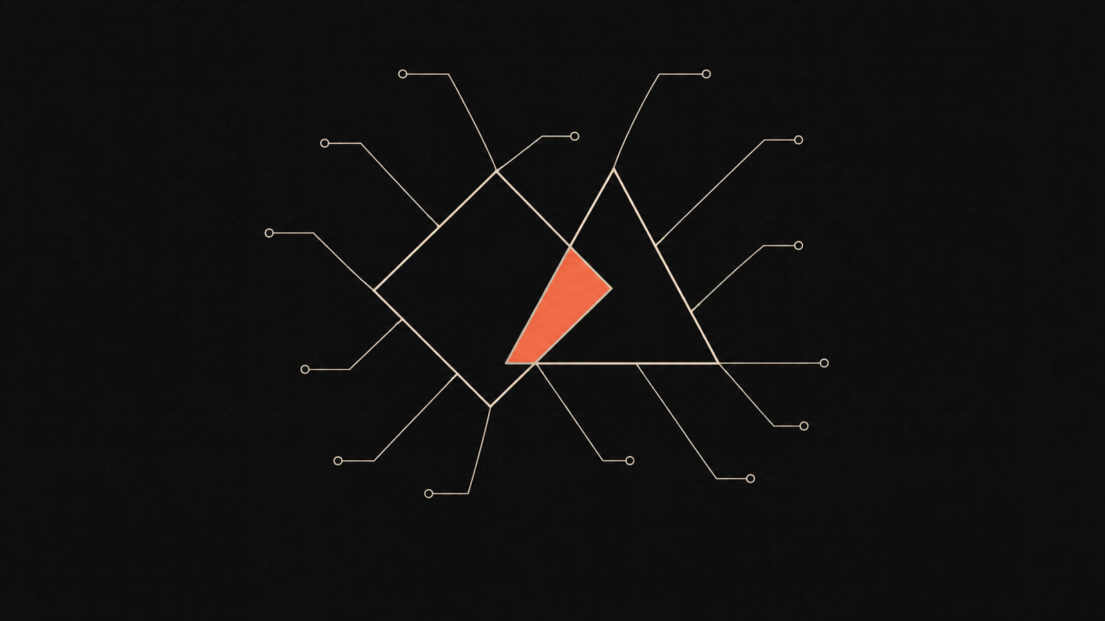
Three qualifications follow in the same entry, and the reel uses none of them. The first makes symbol status depend on the person looking: "Whether a thing is a symbol or not depends chiefly upon the attitude of the consciousness considering it," so someone can make a thing that seems plain to them and "profoundly" symbolic to another (Baynes, p. 603). The second is a designed example. "As a pure actuality, a triangle in which an eye is enclosed is so meaningless that it is impossible for the observer to regard it as mere accidental trifling. Such a figure immediately conjures up a symbolical conception of it" (p. 604). The third concerns making symbols on purpose. "It is, therefore, quite impossible to make a living symbol, i.e. one that is pregnant with meaning, from known associations. For what is thus manufactured never contains more than was put into it" (p. 602). Yet a few pages later, "the passionate yearning of a highly developed mind" can "create a new symbol" (p. 607). Jung's position is narrower than the reel's headline. Decoding a symbol into something already known ends it for whoever accepts the decoding. Whether anything is a symbol at all depends on who is looking.
3. The turbine, and the ritual underneath it
The second half of the reel moves to a different essay, "On Psychic Energy" (1928; Collected Works vol. 8, §83 onward), where the sign/symbol line returns in a new argument. Here symbols are machines that convert instinctual energy into cultural work. Jung's example is a spring ceremony of the Wachandi in Western Australia, in which men dig a hole surrounded by bushes and dance around it. The hole, he writes in Hull's translation, "is not a sign for the genitals of a woman, but a symbol that stands for the idea of the earth woman who is to be made fruitful." Reading it as a stand-in for a real woman "would fatally disturb the value of the ceremony." Then the image the reel quotes: it would be "like smashing the supply-pipe of a turbine on the ground that it was a very unnatural waterfall that owed its existence to the repression of natural conditions" (§88).
The reel stops before the last clause, and the last clause is the point. Jung is answering Freud's account of culture as the product of repression. The same paragraph concedes that the reductive reading is "not only a possible interpretation but also a very true one," and objects only when it is "applied exclusively and schematically." Jung's target was reduction, a single correct decoding, more than explanation in general.
The ritual itself is a weaker foundation than either Jung or the reel suggests. Jung never saw it. The account goes back to Augustus Oldfield, a settler botanical collector, writing in 1865 about the "Watch-an-dies" near Port Gregory, in a frame that begins "Like the beasts of the field, the savage has but one time for copulation in the year." Oldfield printed the chant untranslated. The gloss that makes Jung's reading work ("not a pit, not a pit, but a vulva") first appears in Latin, in a German ethnography by Friedrich Müller in 1873, next to a footnote about Aboriginal anatomy recalling an "animal condition." It reached Jung through two more German compilers. Jung read the same ritual three different ways over his career: as a substitute for intercourse in 1912, as a symbol of the earth-woman in 1928, as an analogy of the mother in 1952. The writer remembered for warning against explaining symbols explained this one three times. The people concerned are the Nhanda, whose Watjandi dialect gave the account its name, and nothing I found records how they understood the ceremony.
4. Logos are signs, by Jung's own definition
The most useful Jung passage for a designer is not in the reel. In "Approaching the Unconscious," his essay for Man and His Symbols (1964), he lists abbreviations like UN and UNESCO, "familiar trade marks, the names of patent medicines, badges, or insignia," and says: "Although these are meaningless in themselves, they have acquired a recognizable meaning through common usage or deliberate intent. Such things are not symbols. They are signs, and they do no more than denote the objects to which they are attached." He adds that symbols are "natural and spontaneous products," and that "no genius has ever sat down with a pen or a brush in his hand and said: 'Now I am going to invent a symbol.'"
Paul Rand reached the same place from the other side of the table. "A logo derives its meaning from the quality of the thing it symbolizes, not the other way around," he wrote in 1991, and "it is only by association with a product, a service, a business, or a corporation that a logo takes on any real meaning" (Rand 1991).
One terminological trap needs naming here, because brand writing falls into it constantly. When designers say "a logo is a symbol," they usually mean it in Charles Sanders Peirce's sense, where a symbol is a sign linked to its object "by virtue of a law, usually an association of general ideas": a convention, like a word. That is exactly what Jung calls a sign. Peirce's symbol and Jung's symbol are close to opposites. In Jung's vocabulary, a logo starts life as a sign, and it can only become a symbol if the people who live with it come to read more in it than anyone put there.
5. When words make judgment worse
The psychology of putting preferences into words begins with a jam tasting. In 1991, Timothy Wilson and Jonathan Schooler gave 49 students five strawberry jams that Consumer Reports had ranked 1st, 11th, 24th, 32nd and 44th out of 45, based on trained sensory panelists (Wilson and Schooler 1991). Half the students tasted and rated. The other half first wrote down why they liked or disliked each jam. The students who simply tasted agreed with the experts' ranking at an average correlation of .55. Those who wrote reasons agreed at .11, close to no relationship at all. Their written reasons predicted their own ratings almost perfectly (r = .92). Writing reasons tied their ratings to whatever their reasons said, and loosened the tie to the jams' measured quality. A second study with 243 students choosing courses found the same pull away from highly rated courses.
Two years later, Wilson and colleagues let 43 women choose a poster to take home: two art reproductions (a Monet and a Van Gogh) or three humorous posters (Wilson et al. 1993). Twenty of 21 women who chose without analyzing took an art print. Among those who first wrote down reasons, 14 of 22 did. About three and a half weeks later, the reasons group was less satisfied with what they had chosen. Their reasons had tilted toward what was easy to put into words, and the humorous posters were easier to justify. The drop in satisfaction was concentrated among women with little background in art.
Other work explains why. People's stated reasons for their choices are often built after the fact from plausible theories about what should have mattered (Nisbett and Wilson 1977). In the "choice blindness" experiments, people who picked the more attractive of two faces were secretly handed the other one, often did not notice, and then gave reasons for a choice they had not made (Johansson et al. 2005). And with art, Akira Yamada found that asking students what they liked or disliked about two Mondrian paintings shifted their preferences toward whichever painting was easier to talk about (Yamada 2009).
These studies have limits. The jam and poster experiments had fewer than fifty participants each, and I found no direct replication of either. The effects were concentrated among people without knowledge of the domain. But the direction is consistent: when people without a trained vocabulary are asked why they like something, the reasons can replace the liking.
6. When describing helps, and what it costs
Describing what you see is a different act, with a different record. In 1990, Schooler and Tonya Engstler-Schooler showed students a video of a robbery, then asked some of them to describe the robber's face. Describers picked him out of a lineup 38% of the time; those who did an unrelated task, 64%. Describing a color cut correct matches from 73% to 33%. Visualizing did no harm, and when people had to choose within five seconds the gap nearly disappeared (Schooler and Engstler-Schooler 199090003-M)). A registered replication across dozens of labs in 2014 found the effect real and smaller than first reported: about 4 percentage points with a delay between describing and choosing, about 16 with the original timing (Alogna et al. 2014).
Swet's own metaphor turns out to be the best-studied case. Jonathan Melcher and Schooler had 107 adults taste a red wine, then either describe it or do a crossword, then pick it out from three similar wines (Melcher and Schooler 1996). Describing hurt one group: regular red-wine drinkers without training, who could tell the wines apart as well as experts when they did not describe, but whose wine vocabulary resembled a novice's. Trained experts were unaffected, and people who rarely drank red wine trended toward doing better after describing. The authors concluded that "verbal expertise can insulate perceptual expertise from verbal overshadowing." Words hurt when perception had outrun vocabulary.
Expert vocabulary also helps other people. Wine experts' descriptions are matched to the right wine more often than novices', especially by other experts (Lawless 1984; Solomon 1990). But in Solomon's studies, handing novices the experts' word list did not make their descriptions as useful: the words have to rest on distinctions the speaker can actually perceive. And the vocabulary is partly a social genre. Wine experts agree with each other about wine more than coffee experts agree about coffee, which Ilja Croijmans and Asifa Majid attribute to wine's established culture of talk (Croijmans and Majid 2016). Expectation bends it, too: a white wine dyed red was described by a panel of 54 tasters with the vocabulary of red wine (Morrot et al. 2001).
Elsewhere, naming helps. Labels speed up category learning even when they add no information (Lupyan et al. 2007). A rubric brought novices' design critique close to experts' in perceived value (Yuan et al. 2016). Studies of knitwear designers found that they talk about new work largely by pointing to existing sources, which is economical and also ambiguous unless everyone shares the reference (Eckert and Stacey 200000022-3)). Michael Polanyi's line, "we can know more than we can tell," comes with a qualification that fits Swet's pantry well: with a police identikit, a set of pictured noses, mouths and eyes, a witness can communicate a face they could never describe, while choosing the right parts stays a skill nobody can put into words (Polanyi 1966, pp. 4–5).
7. Hume's ingredients, Kant's dish
None of this is new to philosophy. In "Of the Standard of Taste" (1757), David Hume used Swet's metaphor almost exactly. He tells the story of two tasters, kinsmen of Sancho Panza, who find "a small taste of leather" and "a taste of iron" in a hogshead of wine, are mocked, and are vindicated when the cask is emptied and "an old key with a leathern thong tied to it" turns up at the bottom. Delicacy of taste, Hume writes, is having organs "so exact as to perceive every ingredient in the composition." It grows with practice, which lets a judge mark "the distinguishing species of each quality," and with comparison: "By comparison alone we fix the epithets of praise or blame." Hume adds a social point that Swet's video implies. General rules and acknowledged models are like "finding the key with the leathern thong": the delicate judge was right anyway, but the key is what silences the bad critic.
Immanuel Kant answered him in the Critique of Judgement (1790). "Though a man enumerate to me all the ingredients of a dish, and remark that each is separately pleasant to me ... yet am I deaf to all these reasons; I try the dish with my tongue and my palate, and thereafter (and not according to universal principles) do I pass my judgement" (§33). Kant still allows critics to reason "so that our judgements of taste may be corrected and extended" (§34). But the deepest things art does, his "aesthetic ideas," occasion "much thought, without, however, any definite thought," and so "cannot be completely compassed and made intelligible by language" (§49).
Read together, Hume and Kant give the same split the experiments give. Naming ingredients describes a composition and lets people work with it. It cannot prove that the composition is good, and it cannot exhaust what the work does to the person in front of it. Pierre Bourdieu would add that the ability to talk about art this way is learned unevenly, and works as a marker of social position. That cuts both ways for Swet's lesson, which hands the vocabulary to people who did not grow up with it.
8. Three kinds of talk
The research sorts into three kinds of words, and the two videos are each about a different one.
The first is explaining reasons: why I like this. This is the manipulation in the jam, course, poster and Mondrian studies. It pulls preferences toward whatever is easy to say, the reasons are often invented after the fact, and the harm is greatest for people without domain knowledge.
The second is describing what is there: the features, techniques, references and ingredients, in a vocabulary shared with the listener. It helps others act on your perception, sharpens categories, and costs nothing when the vocabulary matches the eye. When it does not, describing can blur your own memory of the original.
The third is interpreting meaning: what the thing stands for. None of the experiments above test it. It is where Jung, Kant and Susan Sontag, in "Against Interpretation" (1964), each locate the loss, in the claim to have translated something that by its nature exceeds a concept into a list of concepts.
Swet's method lives mostly in the second kind; one sentence borrows the first. Jung's warning is about a reductive version of the third. And the slide that ends most logo presentations usually mixes the first and third.
9. The rationale slide
The genre is familiar to anyone who has sat through an identity presentation. The mark appears, and then the explanation: the circle stands for community, the open counter for transparency, the forward lean for progress, the color for trust. Its most famous extreme is a document called "Breathtaking Design Strategy," produced by the Arnell Group for Pepsi's 2008 redesign and leaked in early 2009, which related the new globe to the golden ratio, the Earth's magnetic field and the Mona Lisa, among other things (BevNET 2009). It was widely mocked. A gentler case is Airbnb's 2014 rebrand, whose mark was presented as "a symbol of belonging" built from four simpler signs: a head for people, a location pin for places, a heart for love, and the letter A (Design Week 2014). Commentators quickly supplied their own readings, several of them anatomical (Creative Bloq). The public did what Jung's attitude clause predicts: it read the mark through its own eyes, whatever the slide said.
Seen through the research, the rationale slide does two things that work against the client. It decodes the mark into known meanings, which in Jung's terms fixes it as a sign. That is often harmless, since a logo is a sign anyway. But the slide also claims the mark has been fully explained, and so closes the possibility that people will one day read more in it than was put there, which is the only way a mark becomes a symbol. And it invites the client to judge the work by reasons. That is the jam study run in a boardroom: a decision-maker without a design vocabulary, asked to evaluate an identity by checking whether the stated meanings sound right, will drift toward whatever is easiest to justify. The Airbnb mark survived its launch and became inseparable from the brand through years of use, which is Rand's point exactly.
What survives the research is a different kind of presentation. Show the work before saying anything about it, and let the first look happen, since the five-second result suggests first impressions hold up best before words arrive. Then describe the form the way Hume's tasters described the wine: the geometry, the weight, the rhythm of the letterforms, the reference behind the color, the ingredients a printer or an animator will need. That is Swet's vendor language, and it is the kind of talk that helps. Keep the meaning slide short, offered as one reading among the ones people will bring. Let the mark earn the rest in use.
10. Against myself
The rationale slide exists for real reasons, and some of them are good. Clients pay for thinking as well as for form, and the slide is where the thinking becomes visible. A marketing lead who has to defend the new identity to a board needs words to do it with, which is Swet's argument and Hume's key on the leather thong. Without a stated rationale, a mark can look arbitrary to the people who approve the budget.
The evidence I have leaned on is also thinner than it may sound. The jam and poster studies are small and unreplicated, and a jam is not a logo. Their effects were concentrated among people without domain knowledge, and a client is a domain expert in their own business, if not in typography. Describing form is itself selective, and the choice of what to describe already steers the reading. The face studies, the only ones replicated at scale, measure memory for a stimulus, not appreciation of a design.
And Jung's own practice argues against the strong version of my thesis. He spent his working life explaining symbols, by surrounding them with parallels instead of reducing them to one meaning. Paul Ricoeur made that method a principle: "the symbol gives rise to thought," and after criticism comes a "second naïveté" in which the symbol can speak again. Explanation that opens a mark up may do the opposite of the rationale slide. The question is whether a given slide opens the mark or closes it.
11. At the desk, and how this could be wrong
For my own work, the conclusion is a short set of rules. Present the mark before the words. Describe it in the vocabulary of its making: geometry, weight, reference, the ingredients someone else will need to reproduce it. Offer meaning sparingly, as a reading rather than a key, and never as the test the client should apply. When a client asks why, give them the description first, because that is the part the research says helps. My own reference library is indexed by visual technique, which is a pantry of exactly this kind. I wrote recently about the gap between collecting references and making work in The Brush Group; this essay is about what to say once the work exists.
The argument could be wrong in three specific ways. First, a study could show that clients who hear meaning-based rationales choose identities that perform better or satisfy them longer than clients who see the work with only a formal description. That would reverse the application of Wilson's findings to design. Second, if larger replications of the jam and poster studies found no effect of reason-giving on preference quality, the strongest evidence behind section 5 would go. Third, a well-documented case of a mark whose explained meaning became the meaning people actually hold, and that grew stronger for it, would complicate Jung's claim that decoded symbols die. I would want to read any of these.
Until then, I read the two videos as halves of one instruction. Learn the ingredients, and use them to direct the people who make the work. Keep the reasons loose, because they are often written after the liking. And leave the meaning open, because the people who live with a mark decide what it means.
References
- Alogna, V. K., Attaya, M. K., Aucoin, P., et al. (2014). Registered replication report: Schooler & Engstler-Schooler (1990). Perspectives on Psychological Science, 9(5), 556–578. https://doi.org/10.1177/1745691614545653
- BevNET. (2009). Some logic behind Pepsi's new logo. https://www.bevnet.com/bevblog/2009/some-logic-behind-pepsis-new-logo/
- Creative Bloq. The new Airbnb logo was mocked in 2014. Here's how the brand had the last laugh. https://creativebloq.com/news/the-new-airbnb-logo-was-widely-mocked-in-2014-heres-how-the-brand-had-the-last-laugh
- Croijmans, I., & Majid, A. (2016). Not all flavor expertise is equal: The language of wine and coffee experts. PLoS ONE, 11(6), e0155845. https://doi.org/10.1371/journal.pone.0155845
- Design Week. (2014, July). DesignStudio creates "symbol of belonging" for Airbnb rebrand. https://www.designweek.co.uk/issues/july-2014/designstudio-creates-symbol-of-belonging-for-airbnb-rebrand/
- Eckert, C., & Stacey, M. (2000). Sources of inspiration: A language of design. Design Studies, 21(5), 523–538. https://doi.org/10.1016/S0142-694X(00)00022-3
- Hume, D. (1757). Of the standard of taste. In Four Dissertations. https://davidhume.org/texts/empl1/st
- Johansson, P., Hall, L., Sikström, S., & Olsson, A. (2005). Failure to detect mismatches between intention and outcome in a simple decision task. Science, 310(5745), 116–119. https://doi.org/10.1126/science.1111709
- Jung, C. G. (1923). Psychological Types, or The Psychology of Individuation (H. G. Baynes, Trans.). Kegan Paul (original work published 1921). https://archive.org/details/psychological_types ; also Collected Works vol. 6 (R. F. C. Hull, Trans.), §814 ff.
- Jung, C. G. (1969). On psychic energy (R. F. C. Hull, Trans.). In The Structure and Dynamics of the Psyche, Collected Works vol. 8, §§83–92 (original work published 1928).
- Jung, C. G. (1964). Approaching the unconscious. In C. G. Jung (Ed.), Man and His Symbols. Aldus Books / Doubleday.
- Kant, I. (1914). Critique of Judgement (J. H. Bernard, Trans.; original work published 1790). https://www.gutenberg.org/ebooks/48433
- Lawless, H. T. (1984). Flavor description of white wine by "expert" and nonexpert wine consumers. Journal of Food Science, 49(1), 120–123. https://doi.org/10.1111/j.1365-2621.1984.tb13686.x
- Lupyan, G., Rakison, D. H., & McClelland, J. L. (2007). Language is not just for talking: Redundant labels facilitate learning of novel categories. Psychological Science, 18(12), 1077–1083. https://doi.org/10.1111/j.1467-9280.2007.02028.x
- Melcher, J. M., & Schooler, J. W. (1996). The misremembrance of wines past: Verbal and perceptual expertise differentially mediate verbal overshadowing of taste memory. Journal of Memory and Language, 35(2), 231–245. https://doi.org/10.1006/jmla.1996.0013
- Morrot, G., Brochet, F., & Dubourdieu, D. (2001). The color of odors. Brain and Language, 79(2), 309–320. https://doi.org/10.1006/brln.2001.2493
- Nisbett, R. E., & Wilson, T. D. (1977). Telling more than we can know: Verbal reports on mental processes. Psychological Review, 84(3), 231–259. https://doi.org/10.1037/0033-295X.84.3.231
- Oldfield, A. (1865). On the aborigines of Australia. Transactions of the Ethnological Society of London, n.s. 3, 215–298. https://www.jstor.org/stable/3014165
- Peirce, C. S. (1955). Logic as semiotic: The theory of signs. In J. Buchler (Ed.), Philosophical Writings of Peirce. Dover.
- Polanyi, M. (1966). The Tacit Dimension. Doubleday.
- Rand, P. (1991). Logos, flags, and escutcheons. AIGA. https://www.paulrand.design/writing/articles/1991-logos-flags-and-escutcheons.html
- Ricoeur, P. (1967). The Symbolism of Evil (E. Buchanan, Trans.). Harper & Row.
- Schooler, J. W., & Engstler-Schooler, T. Y. (1990). Verbal overshadowing of visual memories: Some things are better left unsaid. Cognitive Psychology, 22(1), 36–71. https://doi.org/10.1016/0010-0285(90)90003-M
- Solomon, G. E. A. (1990). Psychology of novice and expert wine talk. American Journal of Psychology, 103(4), 495–517. https://doi.org/10.2307/1423321
- Sontag, S. (1966). Against Interpretation and Other Essays. Farrar, Straus and Giroux.
- Swet, J. [@jason_swet]. (2026, September 18). Theory of Taste, episode 2 [Video]. TikTok. https://www.tiktok.com/@jason_swet/video/7686923992581623054
- Wilson, T. D., & Schooler, J. W. (1991). Thinking too much: Introspection can reduce the quality of preferences and decisions. Journal of Personality and Social Psychology, 60(2), 181–192. https://doi.org/10.1037/0022-3514.60.2.181
- Wilson, T. D., Lisle, D. J., Schooler, J. W., Hodges, S. D., Klaaren, K. J., & LaFleur, S. J. (1993). Introspecting about reasons can reduce post-choice satisfaction. Personality and Social Psychology Bulletin, 19(3), 331–339. https://doi.org/10.1177/0146167293193010
- Yamada, A. (2009). Appreciating art verbally: Verbalization can make a work of art be both undeservedly loved and unjustly maligned. Journal of Experimental Social Psychology, 45(5), 1140–1143. https://doi.org/10.1016/j.jesp.2009.06.016
- Yuan, A., Luther, K., Krause, M., Vennix, S. I., Dow, S. P., & Hartmann, B. (2016). Almost an expert: The effects of rubrics and expertise on perceived value of crowdsourced design critiques. Proceedings of CSCW '16, 1005–1017. https://doi.org/10.1145/2818048.2819953
Source note: sources were checked on 6 and 7 November 2026. Jung is quoted from H. G. Baynes's 1923 translation of Psychological Types, checked against the 1921 German, with paragraph numbers from the Hull Collected Works; Hull's wording for "On Psychic Energy" and Man and His Symbols was checked through full-text search of those editions. The Wachandi source chain was traced through Oldfield (1865), Müller (1873), Schultze (1900) and Preuss (1904). Hume and Kant are quoted from public-domain texts. The Wilson, Schooler, Melcher and Croijmans papers were read in full; Solomon 1990 and Lawless 1984 at abstract level; Yamada 2009 through a secondary summary. The Pepsi and Airbnb cases rest on trade coverage. Quotations from the two videos come from auto-generated captions.