Română
FinAIx - Finance App Landing Page
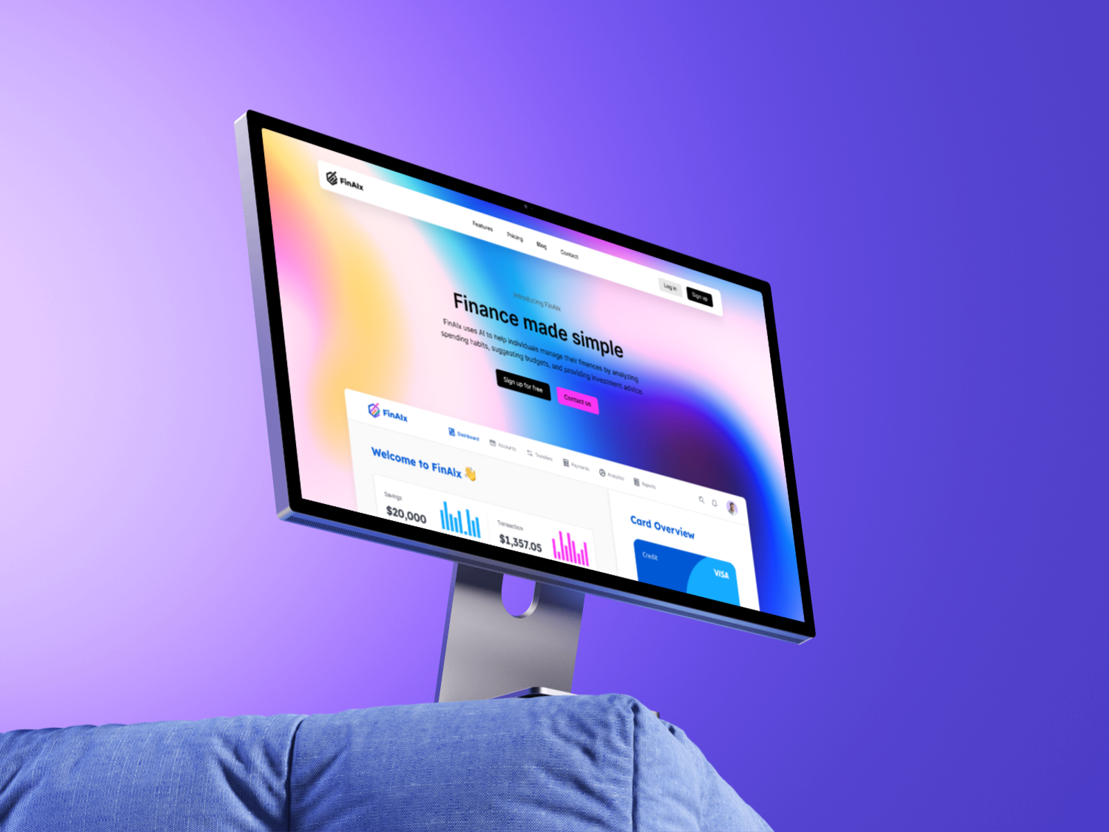
A landing page concept for a finance tracking app, designed to make budgeting, spending insights, and money management feel simple, modern, and easy to trust.
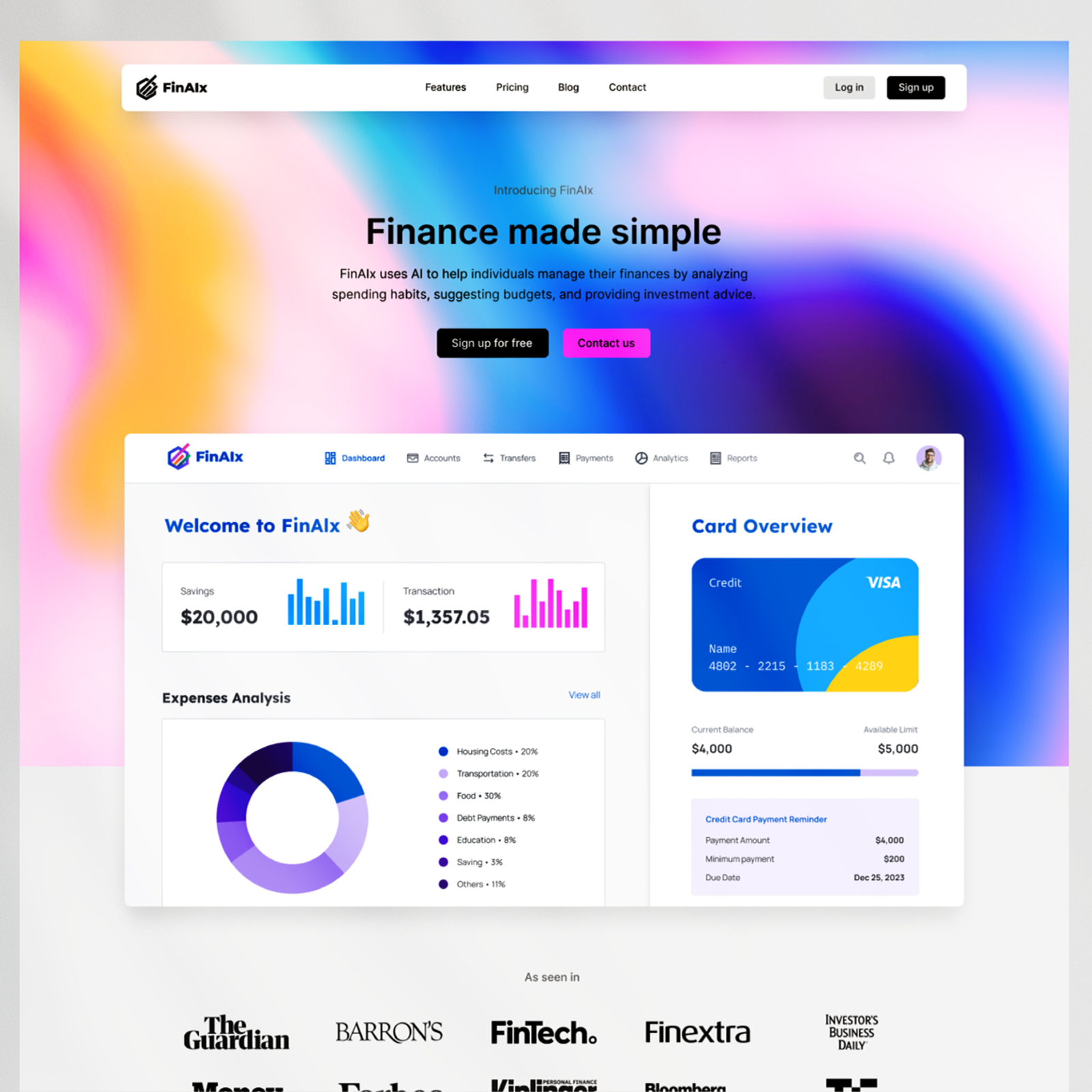
Making Finance Feel Simple
The main challenge was turning financial data into an experience that felt easy to understand, visually engaging, and trustworthy. The landing page had to communicate practical app features while avoiding the rigid tone of traditional banking platforms.
A Clear, Youth-Focused Landing Page
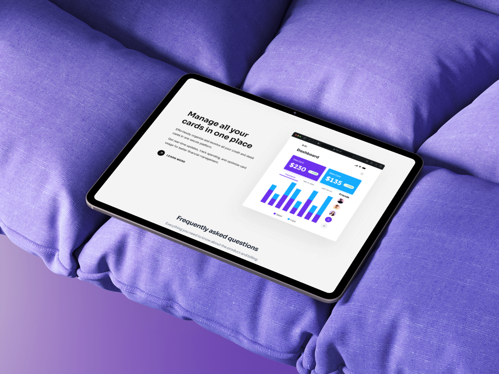
The website was designed around bold typography, vibrant gradients, simple messaging, and structured content sections. The final direction presents FinAIx as a finance companion with personality: practical enough to build trust, but energetic enough to feel native to Gen Z digital culture.
Research & Definition
- 01Researched Gen Z finance habits and product expectations.
- 02Defined the landing page structure and conversion goals.
- 03Mapped core app benefits into clear content sections.
- 04Explored visual directions inspired by fintech, social apps, and modern dashboards.
- 05Designed wireframes to test hierarchy and page flow.
- 06Created high-fidelity UI screens and responsive visual assets.
- 07Refined messaging, contrast, spacing, and calls to action.
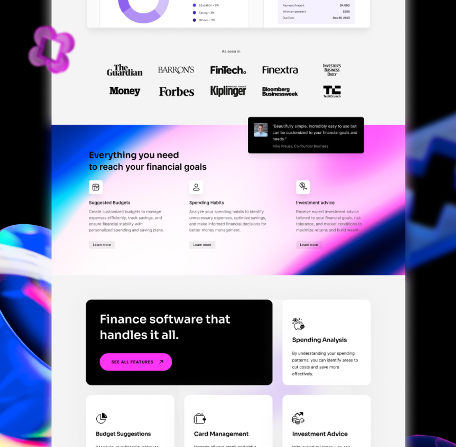
Primary Display: Semi-Bold, Clear, Structural.
Secondary Body: Clean, legible, and mathematically precise for technical data and dense layouts.
Iteration & Refinement
Wireframing
The page structure was tested through quick wireframes to define the strongest order for hero content, feature explanations, and calls to action.
Closer to an App Than a Bank
Once the order held, I pushed the type and the gradients toward social apps and away from banking, then checked the result on product mockups.